


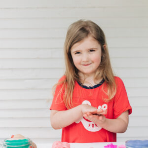
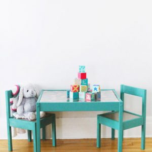


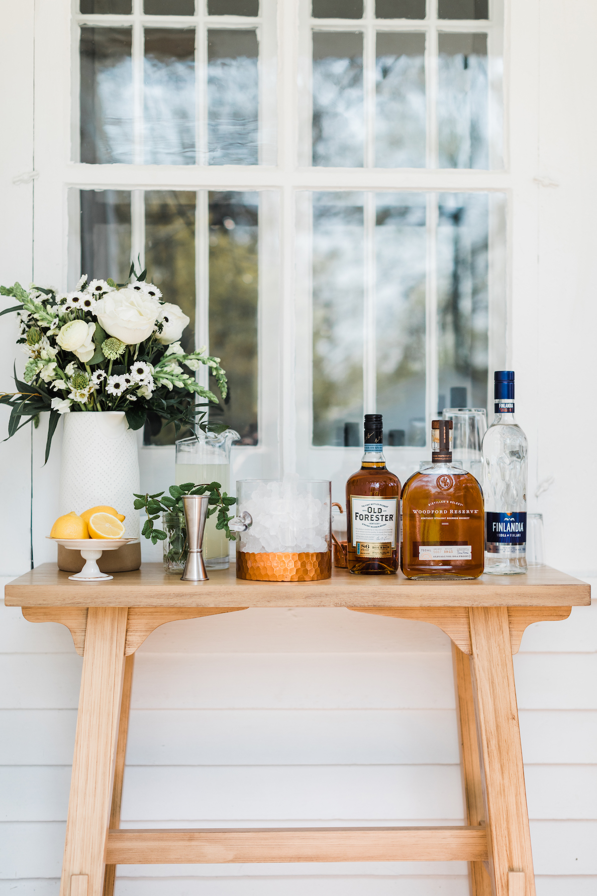


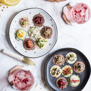


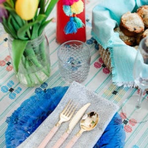


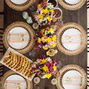


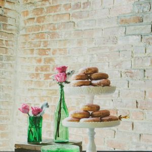


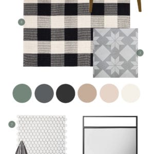


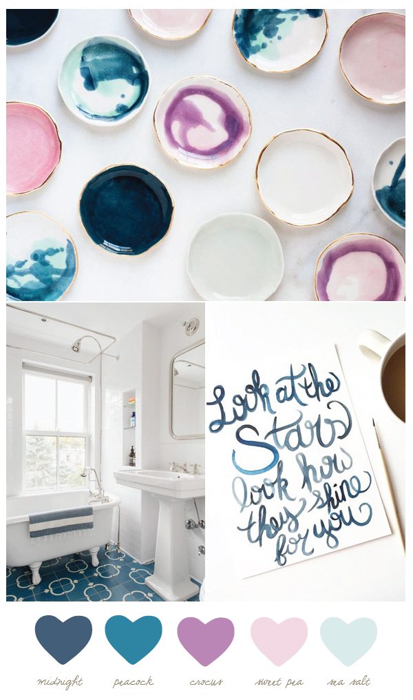
In the last reader survey a few months back, so many of you said that these weekly color palette posts are among your favorite. I was honestly a little bit surprised (just because I know how much you love a good DIY post or a pretty party), but pleasantly so! I’m such a lover of color and love the challenge of finding cool new ways to use color to make a statement. All of this is a little bit of a tease leading up to next week when I’ll be announcing a fun new partnership I’ve taken on for this year that will seriously be one of the coolest collaborations I’ve ever tackled. But today we’re talking about peacock and sea salt and all these pretty shades of blue, purple and pink. What could look like an ode to a unicorn gone wrong looks so sophisticated when paired with lots of white and a touch of metallic gold. Even if I do say so myself, I think this combination is just so pretty and surprisingly chic!
![]()
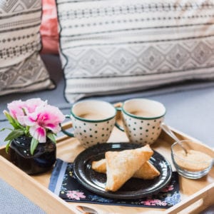
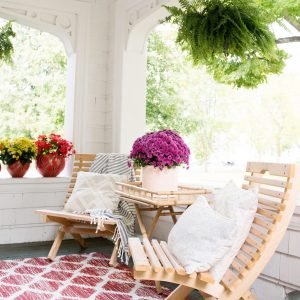
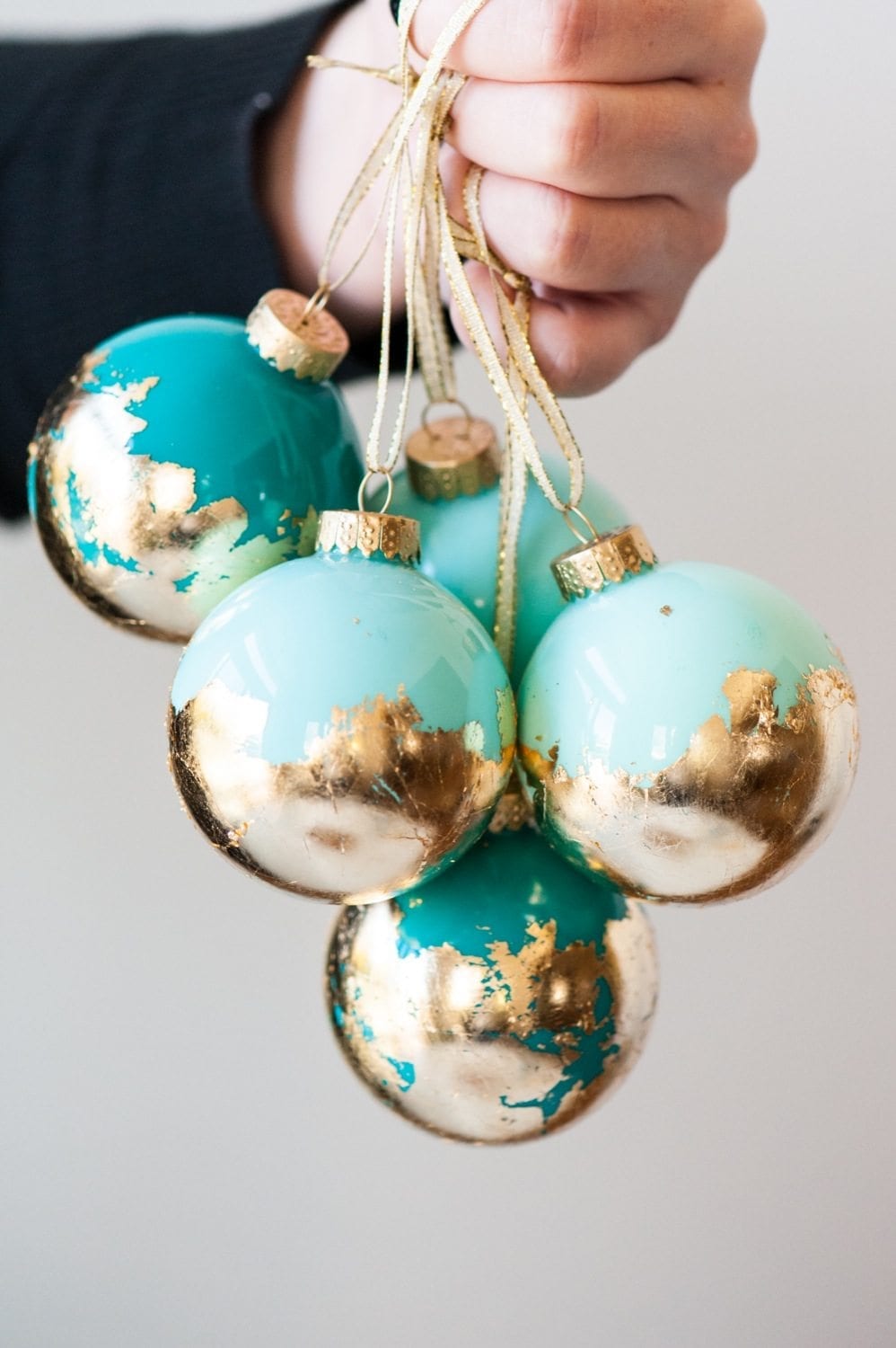
[Photos, from top: Suite One Studio | Dustin Aksland via Remodelista | Melissa Chambers.]


 Back to Top
Who makes the little ceramic dishes? Beautiful.
Absolutely LOVE this color palette! I have to pin it for future reference.
Thank you so much, Kimberly! I’m kind of crazy about it myself, which surprises me because I kind of have an aversion to purple in general. ;-) I hope you’re having a great week! xo