


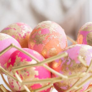
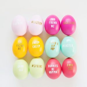


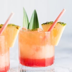
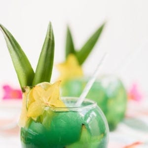
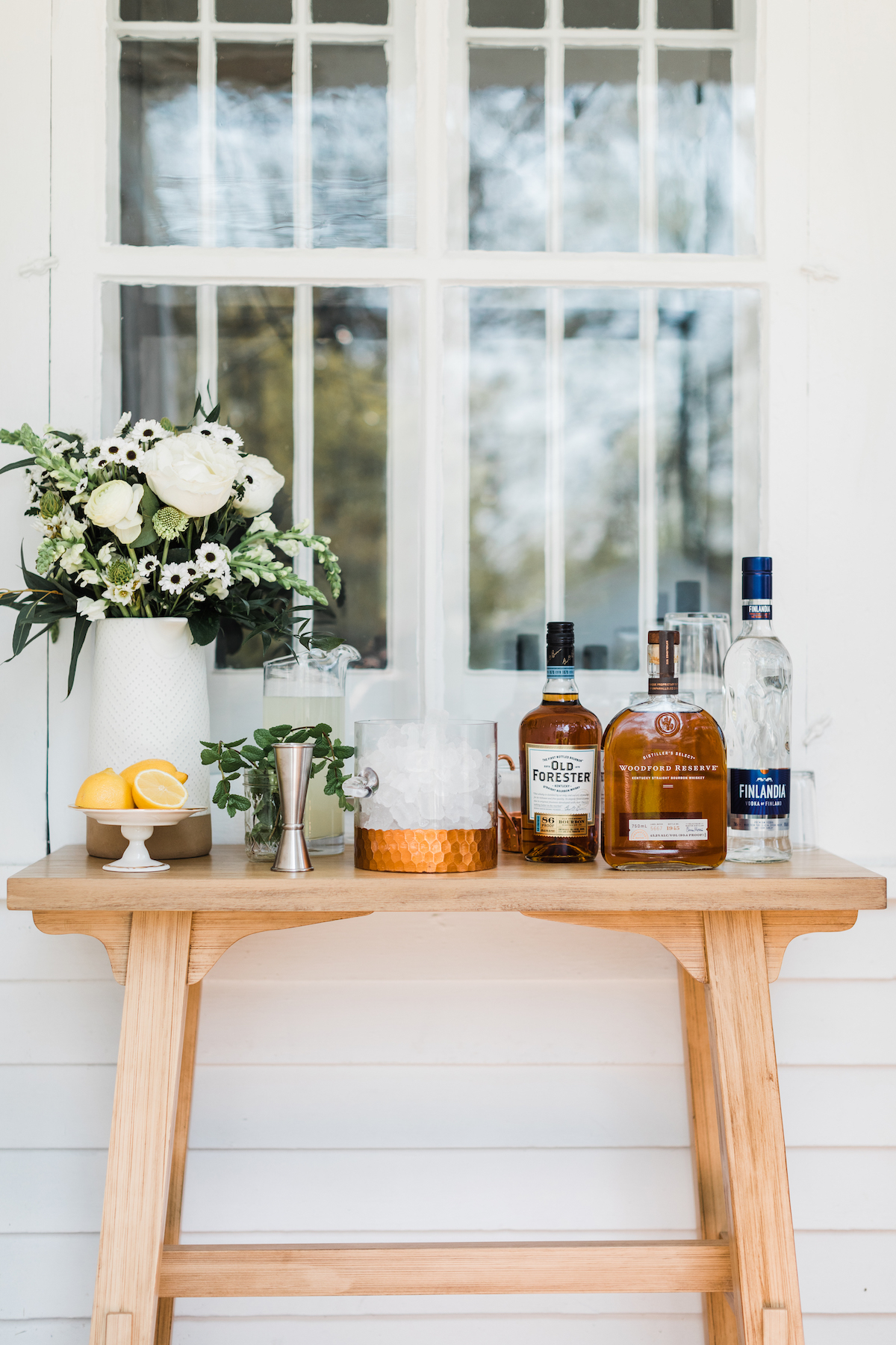
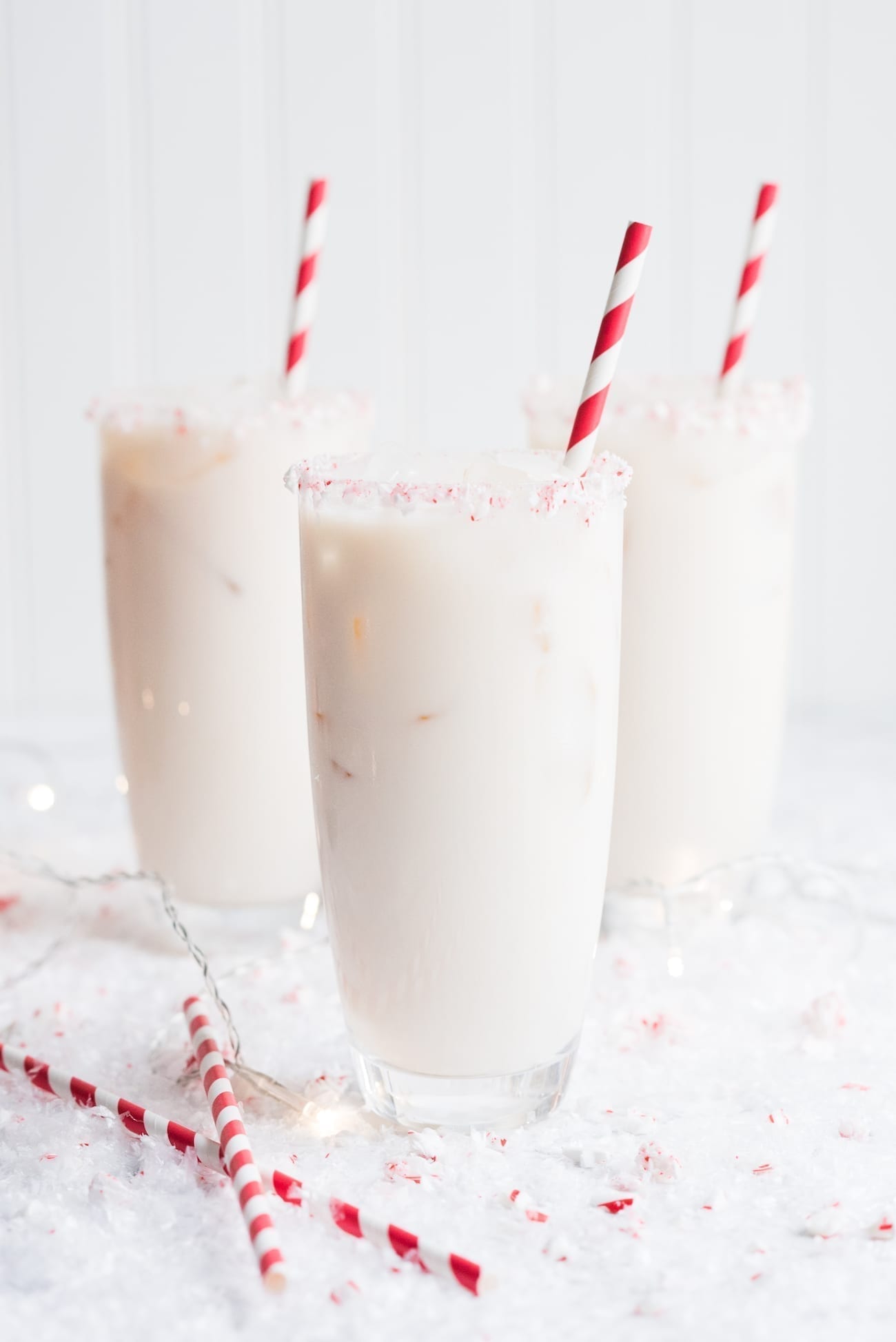

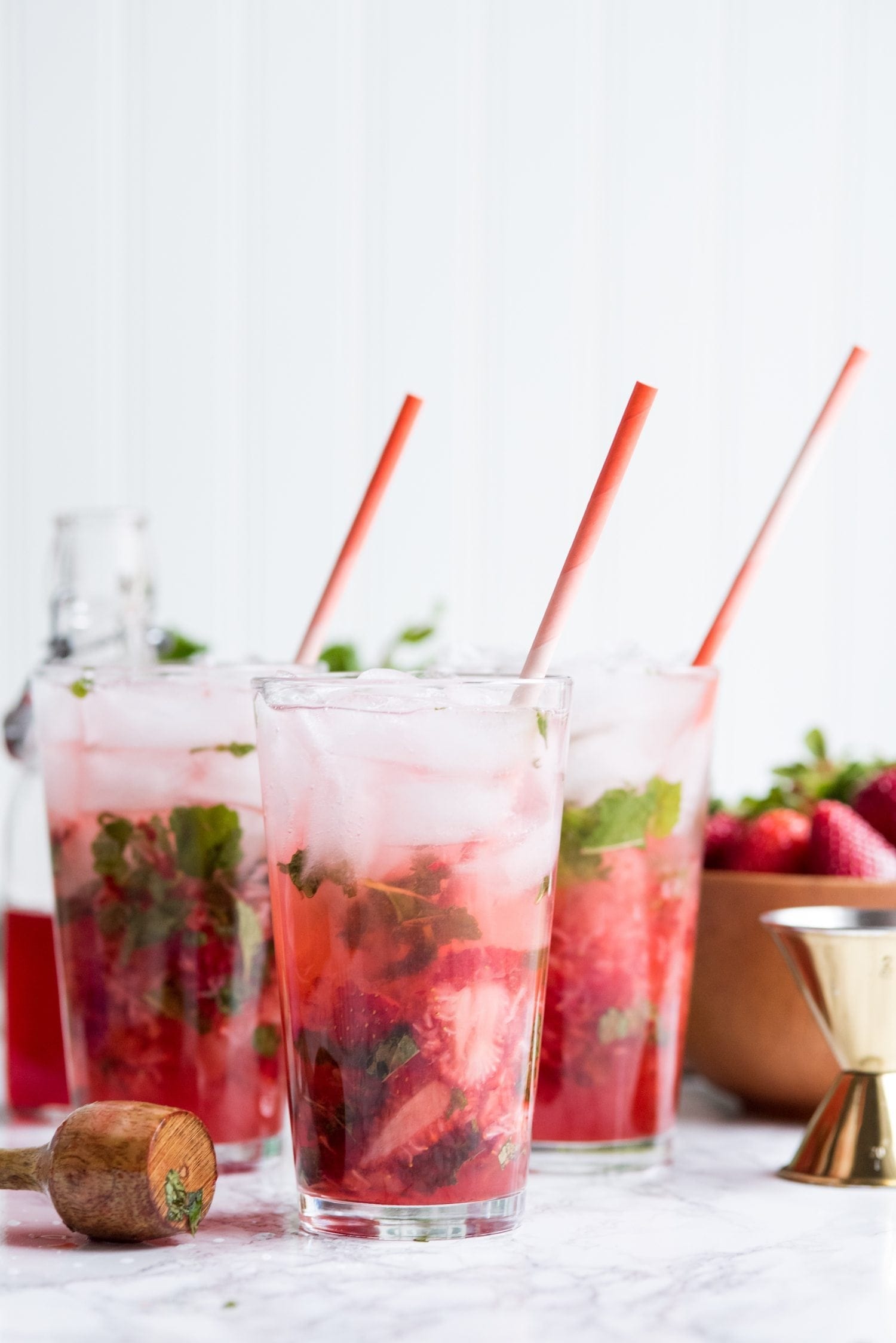
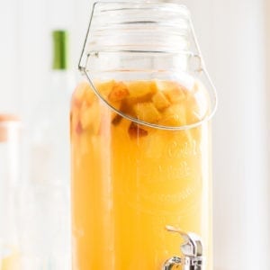


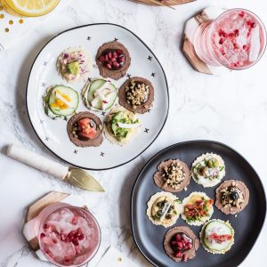

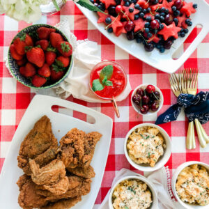
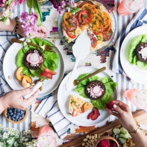


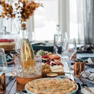


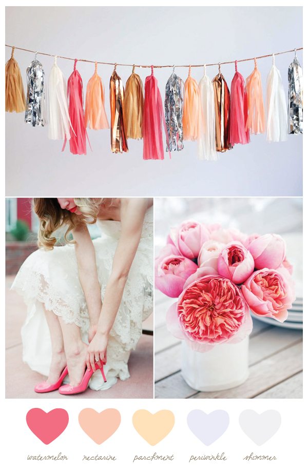
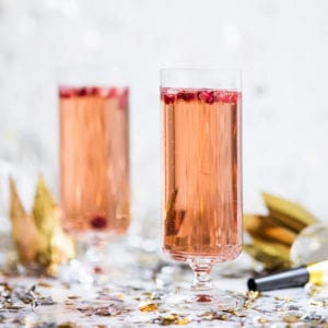
I definitely think watermelon is one of my favorite colors going. Something about it is just so fresh and happy! Not to mention, completely and hopelessly summery in the best possible way. Paired with neutrals like parchment and a bit of metallic copper, it can also be really darn festive. I particularly love this color palette for weddings or jazzy summer celebrations! Not to mention it’s Monday so I think we all deserve that extra dose of happy, don’t you?
![]()
[Photos, from top: Confetti System | Laura Murray Photography via Wedding Chicks | Leslie Shewring for decor8.]

 Back to Top