


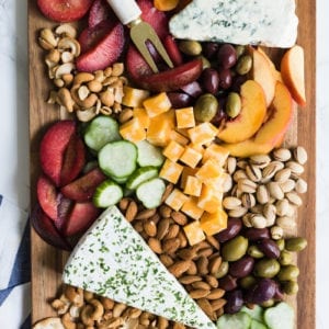


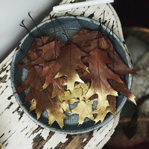


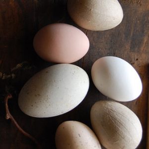


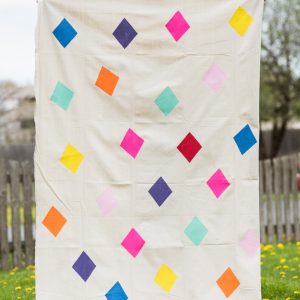


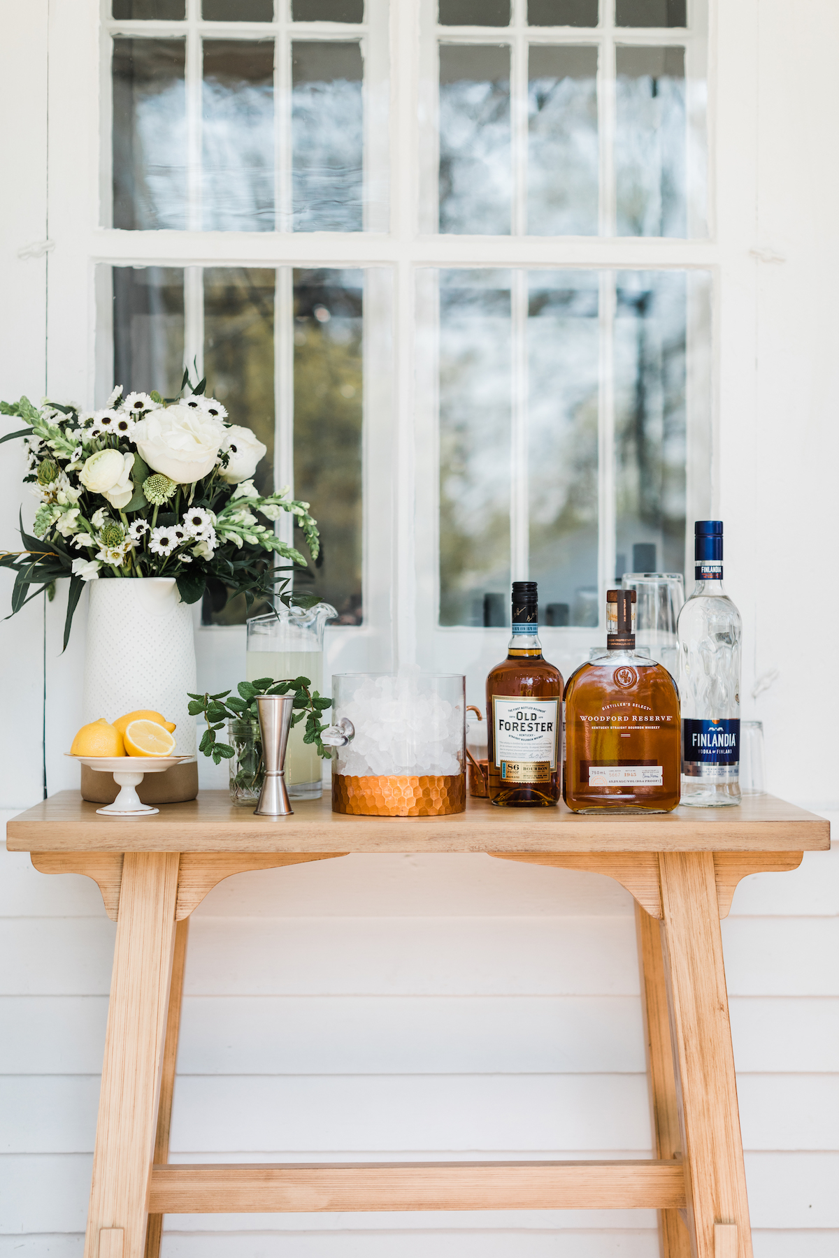


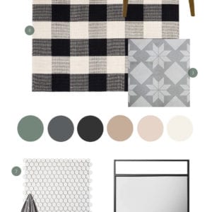


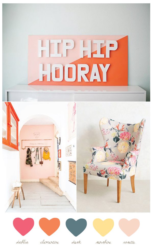
I want to start today by thanking those of you who have taken the reader survey so far! I’m always so blown away by the sheer number of you who take time out of your busy lives to provide me with your thoughts and input and I want you to know how much I appreciate that feedback. I’ve been carefully reading through all of your responses and will be using it to guide me in the coming months. Again, I love you all. Thanks for being the best blog friends a lady could ask for! Now, onto this week’s color palette. So many of you said you love the weekly dose of color inspiration so we’ll jump right into it ok? This week’s palette is another one of those that for me feels perfect for late summer as we transition into fall, without being all red and orange and yellow up in your face. I think with clean neutral walls (like a pale gray or crisp white) it’d make a gorgeous color palette in a living room or bedroom, too!
![]()
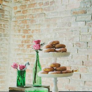
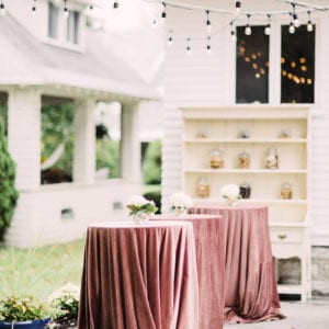
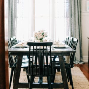
[Photos, from top: Sugar Photography via Julep | Hans Mossel for vtwonen via SF Girl By Bay | Anthropologie.]


 Back to Top
Love this palette, it is so rich and subtle at the same time. The dahlia, clementine, and moonshine come together beautifully with the dusk and rosette.